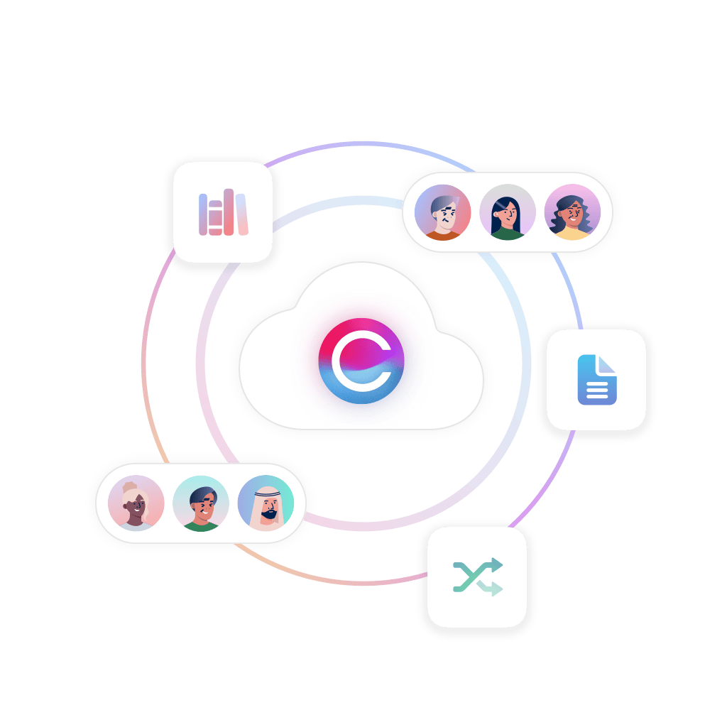
An Employee Intranet Software Platform that creates company-wide engagement

Pages
Build your own engaging intranet pages and target content to specific teams.

Collaboration Tools
Connect your teams with collaboration spaces and corporate social networking.

Document Management
Industry-strength, enterprise level document management software for your business.
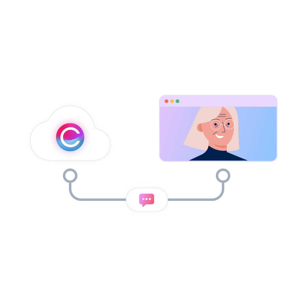
Accessible to everyone
With our mobile intranet solution, we connect everyone in your organization, no matter where they are, to give all staff instant access to the information they need, when they need it.
Strong brand identification
The most effective companies are driven from the inside by employees who understand exactly what the brand represents. An intranet continually promotes a business’s ethos, values, and mission, so that staff can align themselves with the brand and absorb its principles into their practice
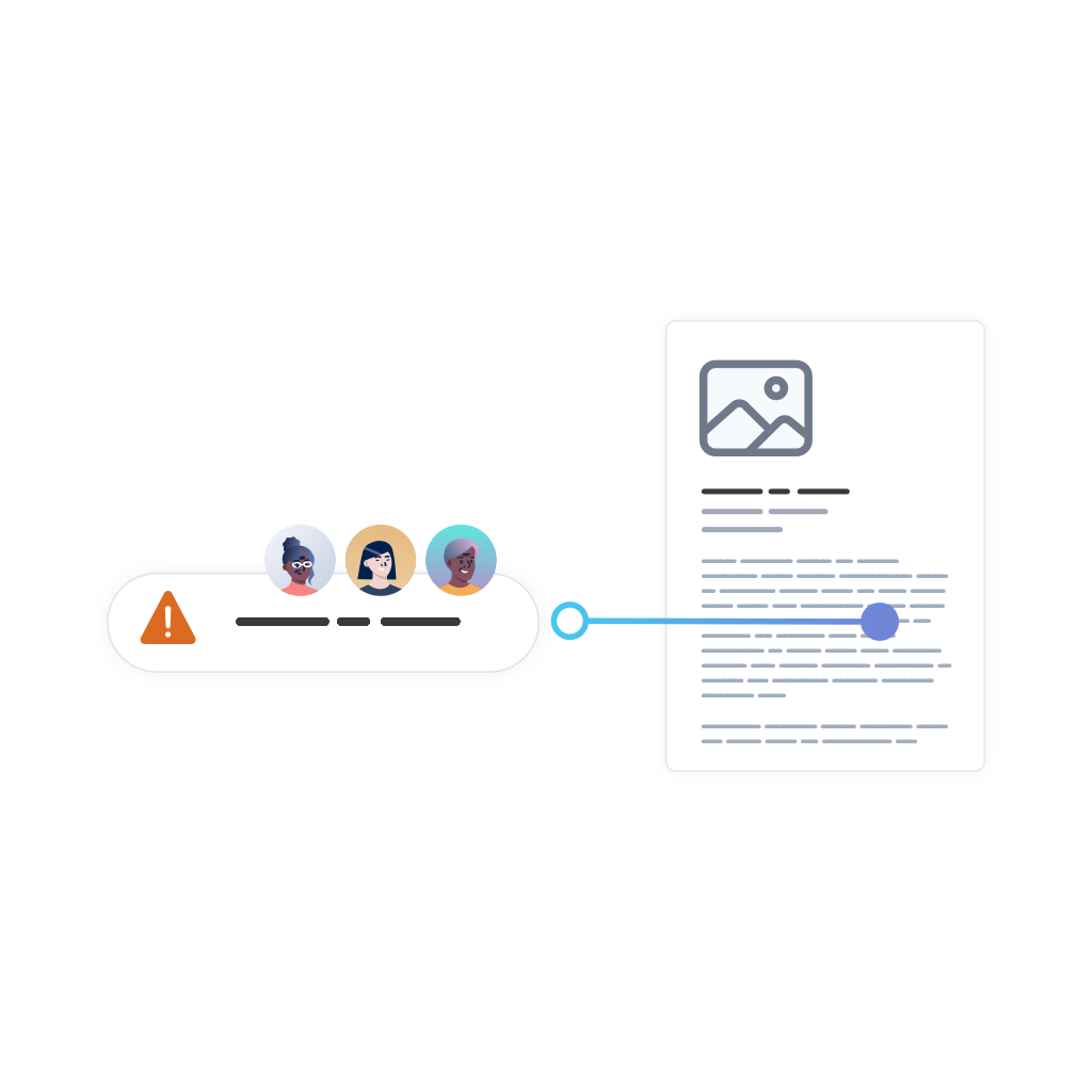
Distribution of urgent information
When you need to quickly reach every member of your team, an intranet is the most effective way to ensure that no one is overlooked. Whether staff are in the office or working remotely, a company intranet delivers essential instant messaging quickly and simultaneously.
Employee feedback opportunities
Providing staff with the opportunity to provide feedback can improve their self-worth, create a more positive and harmonious workplace, and stimulate innovation. Intranet software promotes two-way communication that can benefit both managers and employees alike.
Measurable results
By measuring employee engagement, an intranet platform allows you to accurately measure the impact of your communications so you can evaluate whether they are delivering the results that your business needs to remain agile and competitive.
Personal and valuable content
It’s important that your team isn’t overwhelmed by irrelevant or uninteresting information as this will discourage employee engagement. With an intranet system, you can personalize the content that appeals to individual staff members, without bombarding them with unwanted information.
Featured intranet apps loved by our customers
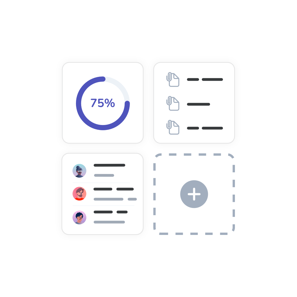
Increase productivity in your teams with an integrated intranet solution
Claromentis are intranet software providers with a difference. All of our apps are easy to access from your integrated digital workspace, making it a one-stop shop for sharing information, task management, collaboration tools, and internal communications. With all tools centralized in one hub, your teams can reduce busy work and be more productive.
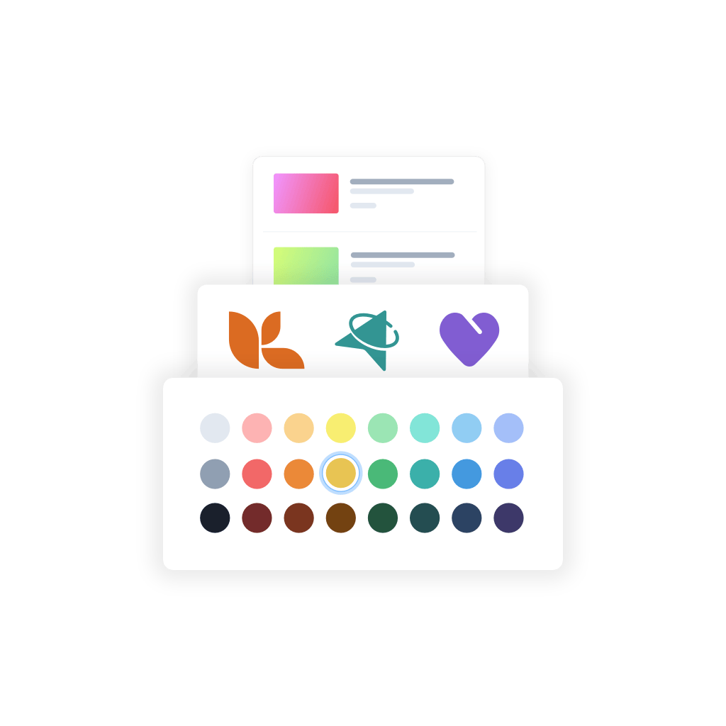
Build your own intranet brand to boost the user experience
No technical knowledge? No problem! Our intranet content management system and design tools make it easy to build an engaging intranet, with no need for technical know-how. Simply drag and drop widgets onto your intranet pages – such as activity feeds and project dashboards – then add your own colors, fonts, and styling. Plus, you can easily update your intranet branding as many times as you like to keep the employee experience fresh.
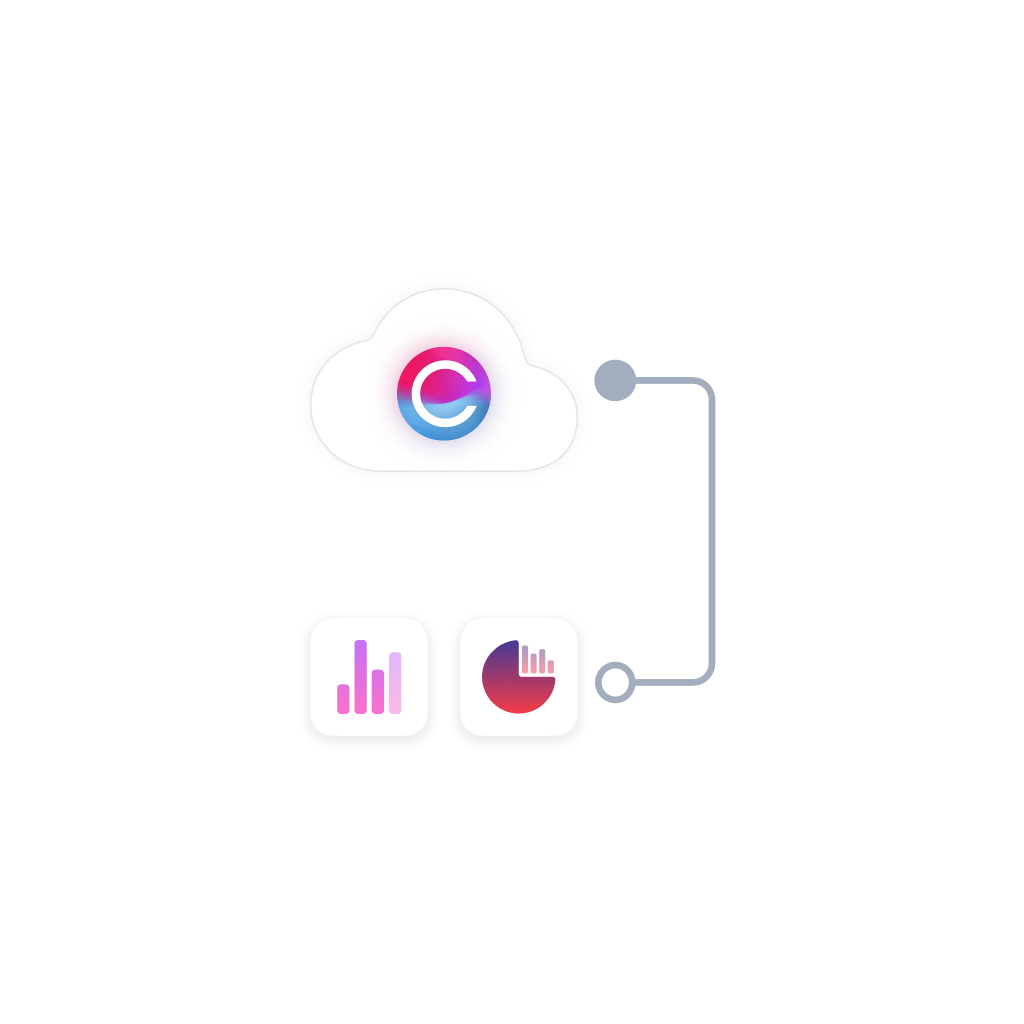
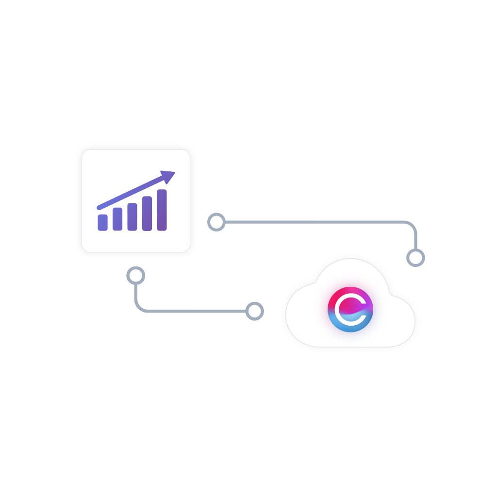
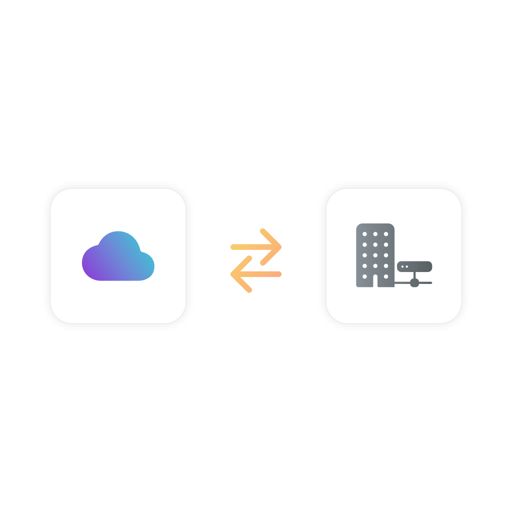
Choose the best intranet hosting option to suit your organization
We provide two intranet hosting options to suit your company’s infrastructure. Choose from our cloud-based intranet solution, which includes our software, installation, Google hosting, backups, and more, in one monthly subscription. Or, pay a one-off fee for our intranet solution and deploy it on your own internal servers – you decide!
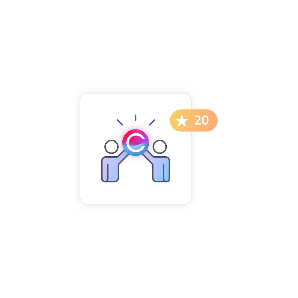
Benefit from over 20 years of intranet expertise
We’ve been in the intranet business for over 20 years, so we know exactly what tools organizations need to support their teams. We’ve built company intranets for every industry including financial, education, and healthcare. We’re constantly improving our software too, with new apps, features, and enhancements added with every new release and update.
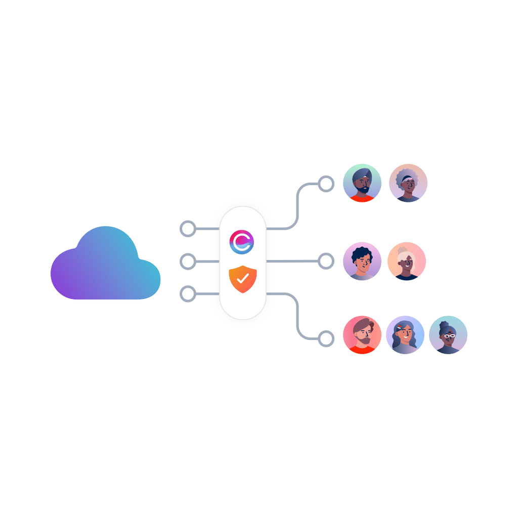
Keep your intranet protected with our in-built security solutions
All aspects of our intranet platform security are important to us. We have a range of security features and procedures in place to protect your intranet data in real-time, and we’re proud to be HIPAA, ISO 9001:2015, and ISO 27001 compliant.
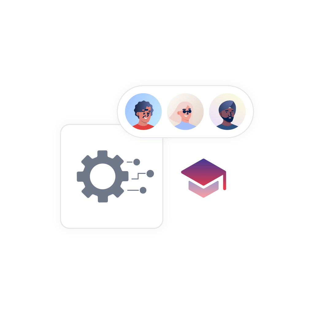
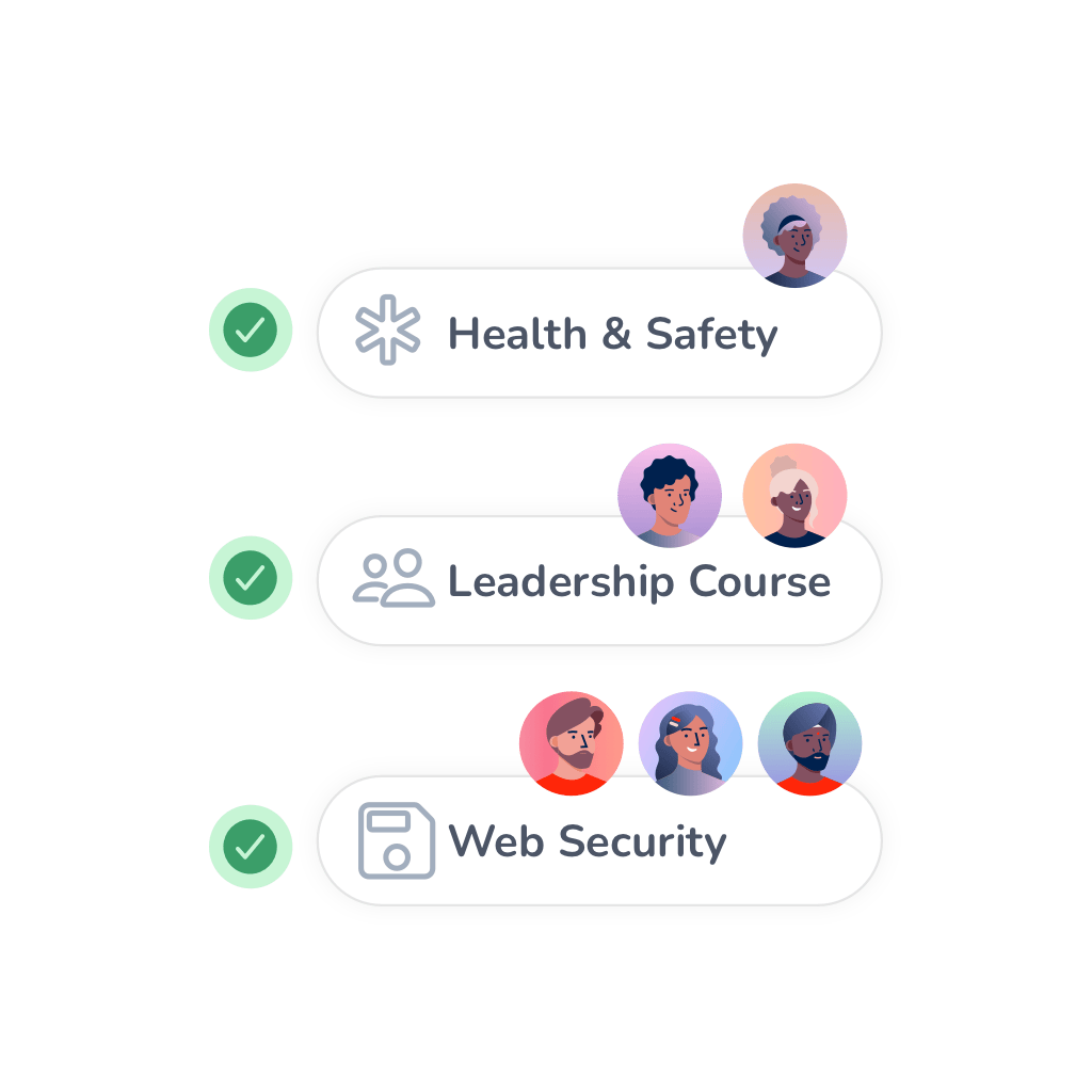
Improve professional development in your teams with learning management tools
Our learning management software is the perfect fit for any company that wants to build their teams’ knowledge and easily integrates with our intranet platform. You can create quizzes, courses, and training materials to boost your staff development program and build personalized learning paths to engage employees with custom learning content.
Get intranet support from our in-house customer success teams
We’re here for the long haul. Our in-house customer success and support teams are on hand to ensure you get the most out of your intranet, throughout every stage of your project. Our online support portal – built using our own software – is your go-to destination for submitting tickets, requesting changes, accessing how-to guides, and getting exclusive access to our webinars.
Intranet FAQs
Cloud based intranet software is hosted on a remote server, i.e. in “the cloud”, and is accessed via the internet. The remote server is usually provided by a third party that is external to the intranet vendor. At Claromentis, for example, we use Google Cloud Platform to host our cloud based intranets.
In the past, most intranets were hosted on an organisation’s own internal infrastructure – this is called on premise intranet hosting. Hosting an intranet on premise usually costs businesses more time and money, and it requires them to stay on top of the latest tech, security, and updates to ensure the system is technologically sound as well as appealing to those who use it. Employee engagement is key to an intranet’s success, so it’s essential that the system is kept up-to-date.
Whilst on premise intranet hosting is still an option, cloud based intranet solutions have become more and more popular thanks to their low initial cost and ongoing convenience.
Hosting an intranet on a cloud based system means that it’s the responsibility of the intranet vendor to look after its upkeep. That means they will deploy the software, maintain the server, run backups and monitoring, install security updates and patches, and much more besides.
Businesses that choose a cloud intranet will quickly discover the benefits it brings, including:
- Simpler pricing: A cloud based intranet doesn’t have any large upfront costs, add-ons, or hidden extras. Everything is included in one monthly subscription, helping companies to spread costs and know exactly what they’ll be paying every month.
- No need for internal IT teams: One of the biggest advantages of a cloud based intranet is that you don’t need an in-house IT team to manage it. And even if you do have an internal IT team, they are often overstretched and under-resourced, and may not have the bandwidth to constantly support the company’s intranet server. Instead, the intranet vendor will take care of everything as part of your cloud intranet subscription.
- In-built security: As part of your cloud based intranet package, you’ll get in-built intranet security as standard. Claromentis’ cloud intranets include multi-level firewalls, vulnerability scanning, penetration testing, brute force protection, monitoring, and encryption, amongst many other measures, to keep your intranet safe.
- Scalability: The best cloud based intranet solution is one that’s scalable. So if your business starts to grow, your intranet can grow with you. At Claromentis, we can easily scale up your cloud intranet storage so that you have more space for all your important company data.


