This year marks the tenth Global Accessibility Awareness Day, where people are encouraged to increase awareness of digital accessibility, in whatever small or big way they can. But first things first: what is digital accessibility?
What is digital accessibility?
Digital accessibility is the practice of ensuring a website or software has equal access, therefore is usable by everyone, including those with disabilities. Websites that are designed and developed with accessibility in mind provide equal opportunities for all when it comes to accessing digital content that’s available on the internet. Without accessibility features in place, people with disabilities will meet significant usability barriers, making it difficult or impossible to use the websites they need.
Digital accessibility doesn’t just apply to websites either. Consider how you could make your internal business tools, like your employee intranet portal, more accessible and usable for your staff as well. Designing your intranet in line with accessibility guidelines will make sure your entire workforce have equal opportunities for accessing and using their digital workplace.
![[FREE GUIDE] 10 TIPS THAT WILL MAKE YOUR INTRANET A SUCCESS](https://no-cache.hubspot.com/cta/default/5025095/6a549aca-8d9d-4916-84ed-c9f30edd10b0.png)
What makes a website digitally accessible?
Making websites digitally accessible to all doesn’t differ that much from the design and usability best practices you would implement anyway. Simple changes can make a huge difference to those with disabilities. Here are a few ways you can help improve accessibility on your intranet:
How to improve accessibility on your intranet
Add alt text to images
Adding alt text to images is a super simple and effective way of making it easier for people with disabilities to understand the content on your intranet. Alt text describes the content of an image, and is picked up by screen reader software that will read aloud the text to the user. This is especially useful for those with visual impairments, and ensures that they can understand what an image means in the context of the page.
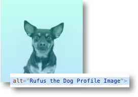
Example of using alt text for images
Ensure you use contrasting colours
If the foreground colour of text, images, or buttons is too close to the background colour, this will make it difficult for some people to read the information. So when designing your intranet, make sure the contrast ratio meets the minimum requirements as set out by W3C.
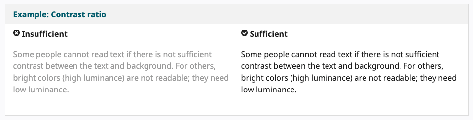
Example of correct contrast usage (source: W3C Tips for Getting Started Designing for Web Accessibility)
Use page titles, headings, and subheadings
When adding content to your intranet, you should format it correctly using the appropriate page titles, headings, and subheadings. These help to summarise and separate large chunks of text, and also makes it easier to digest and understand the information.
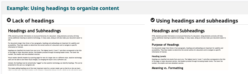
Example of correct contrast usage (source: W3C Tips for Getting Started Writing for Web Accessibility)