Effective intranet design doesn’t just mean picking the right colour schemes, fonts, and logos for your company intranet (although it is important).
Intranet best practices for design first and foremost need to provide an amazing user experience and encourage employee engagement and effective internal communication. And these days, that means creating a corporate intranet that’s mobile-friendly.
That’s because more than half of web traffic now comes from mobile devices, signifying that the days of desktop-only are coming to an end. So, it’s important that your modern intranet design is optimised for mobile as well as laptop users.

Designing your new intranet platform for mobile devices comes with its own set of best practises, not least because you’re working with a much smaller screen size which limits space.
Therefore, make sure you take this into account when planning your intranet adoption, and allow extra time for optimising your intranet design for a mobile version.
Learn how to design a successful intranet solution for mobile devices by following our list of best practices below:
Best practices for intranet design – mobile intranet examples
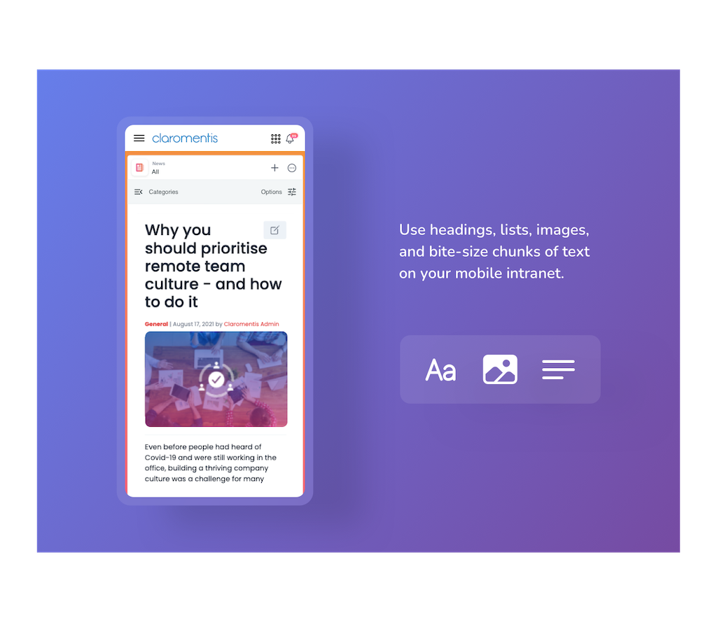
Format intranet content into bite-size chunks
Creating intranet content that’s easy to digest isn’t just best practice for mobile intranets – it should apply across your entire digital workspace too. But in practical terms, intranet content that’s formatted into smaller paragraphs, rather than huge blocks of text, is essential for devices with smaller screens.
So, whenever you’re sharing internal communications on your intranet – whether that’s company news, knowledge sharing articles or online forms – make good use of headings, subheadings, bullet points, images, and lists to make the content easier to read on mobile devices.
Keep menus short and simple
Space is a premium on mobile screens, so don’t waste valuable pixels on long menus that take attention away from meaningful content, especially on your intranet homepage. Indeed, the homepage acts as a dashboard for staff to view key information and get quick access to other intranet pages, so it should remain clean and clutter-free.
Our own mobile intranet software includes responsive menus and easily identifiable design patterns as standard. For example, main menus and filters – which are always present on desktop – automatically collapse into “hamburger” menus on mobile versions to save on valuable space.
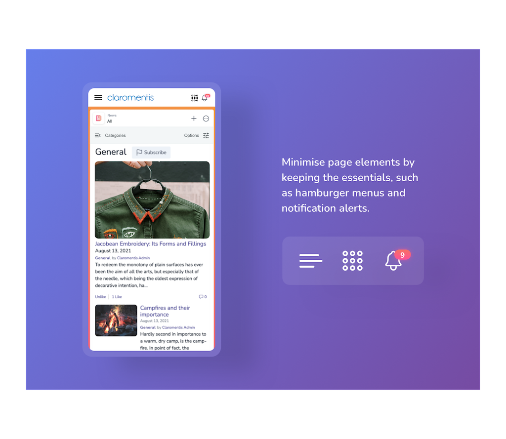
Reduce page elements
Desktop intranet designs have the luxury of space, so page elements such as menus, app shortcuts, bookmarks, and search bars can happily stay put without distracting from the main content.
However, these page elements – whilst useful – aren’t essential, and don’t need to be perpetually present to mobile app users.
Only keep page elements on mobile that provide the most value to users, for example, include a link back to the intranet homepage (which should be presented as a recognisable “home” icon), new messages/notifications, and the main menu. These elements are more than enough to allow users to easily navigate their way through the intranet, whilst keeping the page neat and tidy.
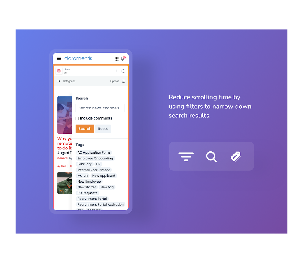
Utilise filters to minimise scrolling
Reducing scroll time is important for mobile intranet success and a better employee experience – users want to get the information they need, and fast, so they’ll have little patience for an intranet design that’s cumbersome to use.
To minimise scrolling and speed up search times, utilise filters. Filters allow intranet team members to narrow down search results by customising what targeted content will be returned. For example, users who want to view intranet news articles about a particular topic can add a filter that only displays articles with a specific tag – rather than scrolling through potentially hundreds of blog posts to find the information they need.
Always check how your intranet design looks on both desktop and mobile device
Last, but not least, it’s important to spend time double checking how your company intranet design translates between desktop and mobile versions.
Use your intranet design tools to see previews of the changes you have made and how they appear on different devices before you publish your demanding work online. Doing so allows you to catch any mishaps before you go live, saving you time & costs from fixing any issues later down the line.