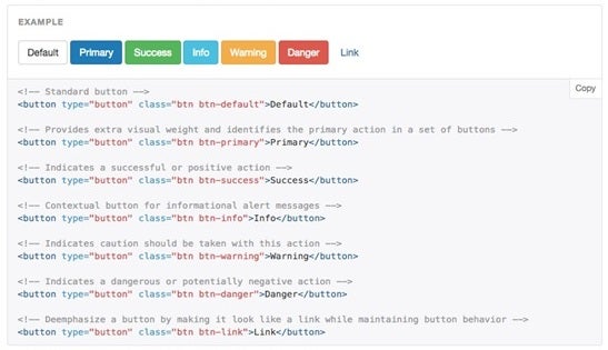
Examples of Bootstrap button styles
User Interface (UI) designers frequently use colour to convey meanings and to add extra visual cues to the interface. We are all familiar with the association of the colour red with “danger”, and green with “OK”.
The Bootstrap already provides a set of pre-styled buttons, but what is the best practise for using these styles, and how do they enhance the user experience?
![[FREE GUIDE] How to Improve Your Project Management Processes in 5 Steps](https://no-cache.hubspot.com/cta/default/5025095/39f7568f-5072-4c75-b782-89ea84fe2a87.png)
Default (white)
This button is essentially what it says on the tin; all buttons will have this style by default, and doesn’t carry any specialised meaning.
Primary (dark blue)
This style is intended for the main and most important buttons on the page, and ideally there should only be one per page. If you have a modal or pop-up window, where users are required to perform an action (such as submitting a form), the associated “Submit” button should be styled with the “primary” option, as this is the intended principal action.
Success (green)
This button is intended to show a positive action, and is normally associated with adding items or creating a new object.
Info (light blue)
The “info” button style should be used to highlight the secondary intended action on the page. Alternatively, this can also be used to emphasise that by clicking this button, this will return a new modal or pop-up which contains useful information for the user.
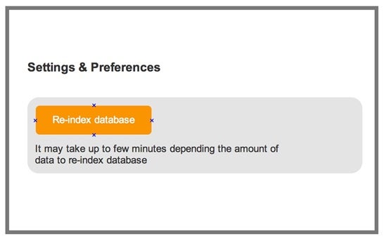
Warning (amber)
This style indicates that there is some level of consequence once the user presses this button, and there may be a wait time for the associated process to finish.
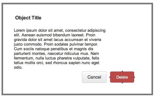
Danger (red)
This style of button suggests that by pressing this, there will be irreversible consequences, for example, a “Delete” button.
So by simply using a standardised set of colour conventions, this enhances the user experience and creates a feeling of consistency throughout the visual inteferace. Even with just a glance, users will be able to determine if they are about to click a button that will either add or delete an item, or perhaps just provide some useful information.